The Department of Social Work is privileged to have amongst its community Gaverne Bennett who shares the background to his groundbreaking idea which began over 20 years ago.
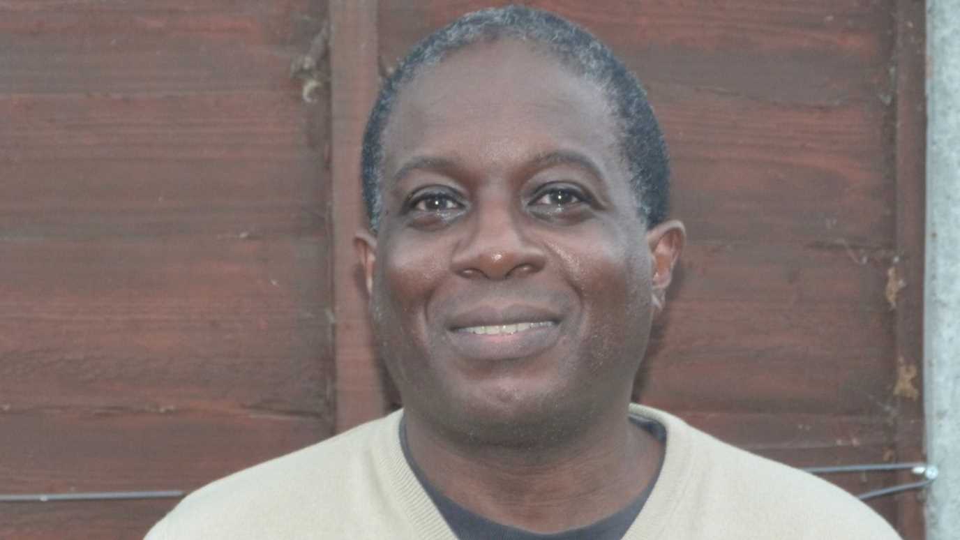
Gaverne Bennett
Q: I was really impressed by seeing your piece in The Guardian and the new wall charts on race and black history right up to the present. Tell me more about the background to it?
GB: I realise now, looking from the vantage point of a time when the Black Lives Matter movement has become prominent, that this Black History wallchart was born in the period of the Stephen Lawrence enquiry; reached a wider public during the time of Obama’s election; and now has reached a greater worldwide audience. It has gone into its second edition due to events following George Floyd’s murder and Black Lives Matter. The piece in The Guardian really started about 20 years ago. I was watching a TV programme about the world at Zero-AD and couldn’t understand how it managed to feature everywhere at that time – Europe, Asia, parts of the Americas, even Antarctica - but nothing about Africa, Africans, peoples of African descent, even though one of the 3 wise men was clearly shown as being black! So, I began to compile my own timeline in my spare time.
Looking back on it I realise now that the timeline itself was born in a time similar to now i.e. where there was heightened discussion about race because of the murder of Stephen Lawrence and the McPherson enquiry. I then went to live in France for a few years. On my return somebody remembered the work I had done so suggested I contact The Guardian. By this time Obama was entering international consciousness. Also, we were approaching the 60th anniversary of Windrush arriving. Again, it was a period where race was more central to the everyday agenda.
The interest and support from people at the Guardian helped to get the whole thing off the ground, as did contacts I made with academics from a broad range of fields who were happy to add their time, expertise, and energy to the project. The first edition of The Guardian Black History timeline was published in October 2008 on the eve of Obamas election, during Black History month. It was well publicised so got an excellent reaction, from around the whole world. I heard from people across the globe and it rode the wave of optimism that flowed from Obama’s election.
More recently it was noticeable, even before the murder of George Floyd, that the issue of race was coming more and more to the centre of public debate. The Black Lives Matter movement was finding echoes in popular culture (the Black Panther movie, for example). In the aftermath of the protests about George Floyd’s death, people began to ask questions about how we had ended up where we were. In Britain, I think that debate became intensified when Colston’s statue, a slave trader in 17th century Britain, was thrown into the River Avon. It was at that moment I started to get more insistent enquiries about the wallchart I had done in 2008.
Talking with journalists at The Guardian it was decided that it might be a good to update and republish the wall charts. Thankfully, I had been collecting information over the years so was able to help create an extra sixth wallchart, to add to the five that had already been done.
The reaction has actually been overwhelming. To be honest, when I was putting this one together I knew it was in an entirely different atmosphere to 2008, but the positive response, particularly from young people, has been noticeable. It is nice to have an idea you originally have in your front room spluttering over something you watch on TV one late evening, reach millions of people.
Q: The timeline charts were published in the context of #BlackLivesMatter and a number of national and international events which highlighted racism and the significance of race. Can you say more about why you think the charts are important at this point in time?
This timeline is particularly important because a crisis produces questions. I believe whenever people realise they are living in an historic time and are uncertain about what is coming next, they tend to look back before they step forward. I noticed at the time of Stephen Lawrence’s death and subsequent Inquiry, and Obama’s election, people wanted to know about Black history. I think back then it was because with the fall of Apartheid in South Africa, the impact of Michael Jackson’s music - until Michael Jackson, and Thriller specifically, black music was not taken seriously, black artists were side-lined - his public success ended the black music circuit in the US and made it normal to see black artists on TV all the time. These and the growing prominence of black people in public life meant it was generally felt we had moved on in some way into new ground.
This time I think it is the same yet different. I think with everything going on with Trump, and the sense of threat to all the racial progress of decades, and even democracy itself, people feel an urgent need to know how we got here, what we do next, and how can we do better. From the feedback I got from people they were glad that the timelines provided them with a ready and accessible overview. And they also had enough depth to encourage people to want to read further. A lot of people told me that they liked the sense of hope that permeates the timeline and I was really glad to hear that.
No one – and I mean no one – knows what is going to happen next. What I hope I have done is strengthen and empower people to deal with whatever comes next by outlining the mistakes others have made in similar situations. If you feel like reading something or even doing something after you read this timeline I will be glad. To answer your question, though, I feel the timeline is one of the few lucid explanations out there as to where Black Lives Matter actually comes from, why it has become internationalised, and more specifically why it has had an echo in the UK (see UK timeline).
Q: It’s very impressive that you completed the new wall charts whilst you were completing the first year of your MSc Social Work studies. As someone well on the way to professional qualification have you any reflections on how being a social work student influenced you in any way?
I think the latest edition - July 2020- that I did of the timeline wallcharts was immeasurably superior to the first edition I did in 2008 due to the fact I am doing an MSc in Social Work at Royal Holloway. What the course allowed me to do was to see how many of the historical issues that featured on the timeline were playing out in people’s lives now, today.
Completing my first placement and examining social work theory I was able to see how it might be possible to provide better support to service users by developing better understanding of their individual timelines with them. I think having to participate in decision-making with people in the community, contributing to decisions where positive outcomes have to be seen from multiple perspectives permeated the timelines this time. It was important not to take anything for granted. That was down to being on the course and I think it contributed to the more positive reaction to the Guardian articles and the wallcharts this time.
Also, what the course allowed me to do was to broaden my conception of intersectionality, to really step back and reflect on what I was trying to do and wanted to achieve, and to get a sense of the world through many different ideas. Excellent lectures on psychodynamic theory and anti-oppressive practice really made me rethink what I wrote. I think what the MSc has given me is the ability to reflect on my actions, the impact they might have, and a firm theoretical perspective that I was applying to supporting and collaborating with service users.
It is one thing to have knowledge of the history of race, but another to how to bring together your experiences, the theories you have learnt, to help a particular individual deal with the issue that can really make their life better in the here and now.
The reason why I would encourage people to study with Royal Holloway (and I am glad I did because I actually received 4 other offers) is one has the feeling on the course that all the knowledge you have, the immense knowledge you will gain on the course, is being directed to something practical, useful, makes you feel good to get out of bed in the morning. You can use whatever skills you have not to just simply help service users through crises, but to help them see the potential within themselves, to grow their confidence, to see a positive future amongst their circumstances.
To some degree much of the Black history timeline I created, especially in its middle part, deals with human beings that have been marginalised to the point that they are said to have no history. Yet people do have history. To a certain extent I feel that being a social work student has allowed me to think about this even more holistically and intersectionally in developing the 2020 edition.
See the Guardian article introducing the new 2020 edition of the black history timeline:
Timeline wallcharts:
https://guardianbookshop.com/guardian-merchandise/gb-prints/gb-black-history-wallcharts.html


